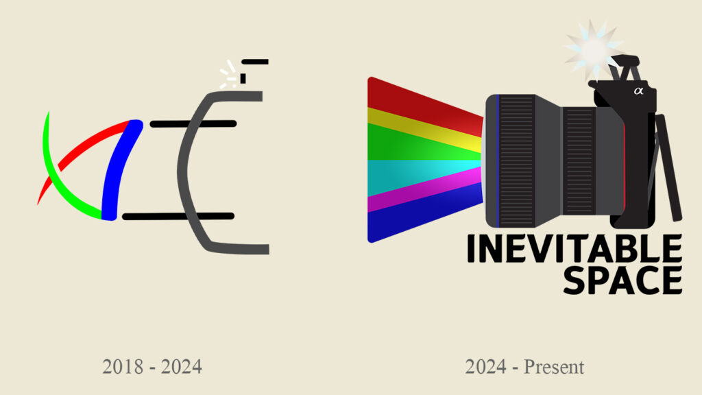
Originally, I wanted my logo to illustrate a simple camera with the primary colors of light into the lens. I thought this logo was simple and illustrated the point that I was a Photographer. I designed this in Inkscape since it was a free Vector Graphic Program. The Logo shown is actually a later revision of the original, however the basic design remains the same.
The new logo shown on the right, illustrates the same concept, A camera with colored light going through the lens. I changed the silhouette style to a more modern design. First, I made the camera body look more like the camera I started with, a Sony a6000. I then included a nice lens that was designed to look like a Sigma 24-70mm Lense for Sony E Mount. I also included more colors to illustrate what is used in photography and print mediums, Red, Green, Blue, and Cyan, Yellow and Magenta. Finaly, I added the name, Inevitable Space, to present my business name in an easy to view fashion. The updated version of my logo was created with Adobe Illustrator 2024.


